ShopDreamUp AI ArtDreamUp

Deviation Actions


Suggested Deviants


Suggested Collections


Comments5
Join the community to add your comment. Already a deviant? Log In
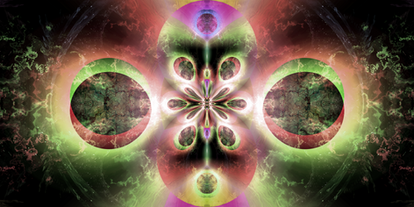
I agree with the lady who said that the choice of colors was strong. You're starting to get the hang of picking strong color choices- however, don't become self-absorbed and assume that all of your color choices will be good ones. You should continue to be insightful, and critically think about why you choose this color over that color, etc.
I see (unless I am mistaken) that you were going for a background akin to a wall. However, it simply doesn't look enough like a wall. I don't know how else to put it. It looks too much like it came from the 90's. Granted, simply pulling off something that looks remotely like a wall is a challenge within itself, so I applaud you for that.
It looks as if you are starting to develop better themes in your art- that is a good thing. There are too many fractal artists who render random blobs and then apply names to whatever they think it looks like. Here, it's more of the opposite. You had something in mind, made a tentative title, then created a fractal based on your objective. Keep doing that.
I feel as if there isn't enough stuff going on down near the bottom. I understand that it is meant to be the stem, but it the stem isn't playful enough.
I would have enhanced the shadow of the "bouquet" quite a lot more- I assume that you were trying to make a shadow behind the fractal? There isn't enough sense of depth.
Going back to the wall, though, I guess it would have worked better had the wall been either more playful or more serious. Here, it's in an unsettling mix of the two. I could see a serious type of slate or wood working as the wall- I could also imagine a hot red or a mix of black and neon working as the wall. This, however, doesn't do the flower justice.
Great job overall. There are just a few things that could have been better.